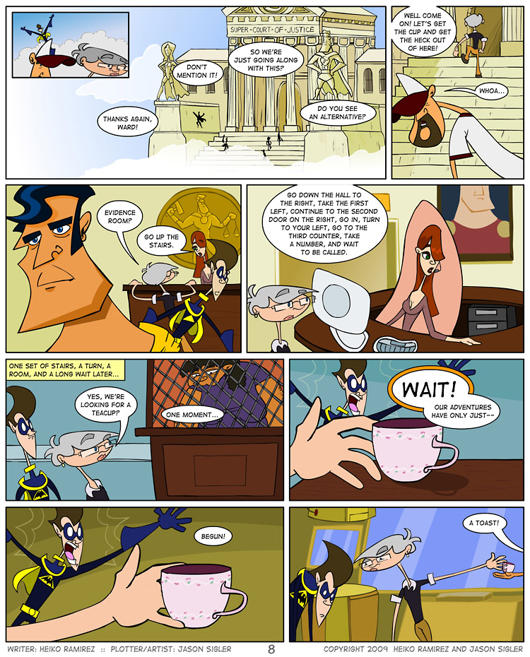
Though it hurts to say, this is the penultimate chapter of the Captain Excelsior arc, and the final page to feature the characters and world of Zach Weiner and Chris Jones’ design. I would like to take a minute to thank those guys for letting us give this experiment a whirl with their beloved comic as a test run. I had a blast using Capt. Excelsior himself, not to mention his diverse cast of losers and screw-ups, and that wouldn’t have possible without the free reign Zach and Chris provided us with. Hopefully all creators we approach in the future will be as open and generous as these two, so that this concept can really take off.
With that, and a little bit of Brigid’s intrepid spirit, we bid adieu to the world of superheroes and mumble a half-hearted, “Hey” to the real world, or as real and normal as this cast is going to see. Rest assured, should the real Brigid Alverson, Interwebs webcomics blogger extraordinaire, ever come across a city in the clouds, I’m sure she would be more inclined to stick around and see the sights than her headstrong cartoon alter ego. (And yes, those are three separate links to her various web locations, so get to viewin’!)
There’s one final splash page to finish out this first arc and then it’s onward to the next world, which… I will reveal next week! But don’t forget to stay tuned throughout the week for added content, straight from the production blog!


I’m really liking the writing on this webcomic, and I want to see where it’s going. It’s not very original but it works, it’s just great fun.
The art though is a problem, from the bad framing to the weirdly deformed characters (I’m not even going to talk about anatomy here) to some really poor choices in storytelling (the story doesn’t flow at all), there are so many things that just don’t work! The style, which I guess is supposed to be kind of cartoon caricature, comes out as stilted, inconsistent, like somebody’s idea of what ‘cartoony’ should be but with no clue on how to draw it. God, this is awful.
Sorry to be harsh on Mr Zigler here, but seriously this comic would have so much more potential with another artist. It looks terribly amateurish, especially on a website that reviews other webcomics. It’s like if somebody was giving recipes to cook instant ramen on a website where they also review top restaurants. It’s nonsensical.
And please fix those word balloons, they look terrible.
Hope you carry on guys and maybe find a better artist to draw that!
Jordi
Wow, that is a rather critical critique to leave up as a comment. First, thank you for the complement on the comic in general. We are taking a completely different approach to comic creation in general, as an experiment. It won’t become apparent until at least another 20-30 strips.
My reply is that I am enjoying Jason’s style and have seen it improve over the past couple years. Critiques should be helpful and point out how to make something more appealing to the one critiquing. From the comment there appears to be nothing that tells me what Jason should ‘improve to’ or what you specifically don’t like.
The irony is a critique on the oldest webcomic review site, about their amateurish ability to create a comic, was left by leaving an amateurish comment.
Well said Daku. Me personally, I’d have just said to Jordi: “Damn dude, you’re an ass.”
Since I’m here…
Jordi,
You’re an ass.