Perhaps my favorite book, from my childhood, were the books written by Madeleine L’Engle. Starting with “A Wrinkle in Time” and going through the rest of the series I can recall so many good memories and imagery that most of the books and even webcomics I have read since have been reflections of those books. That’s probably the best compliment I can say of an author and the best I can give is the node in this comic. (more…)
Fascination with Death
The past couple weeks I’ve been reading the Discworld series and I’m completely hooked. One of the main characters is Death, who walks around as a normal person, if a normal person were seven feet tall, a skeleton, and carrying a scythe. This character is always portrayed best when there is no regard to good or evil. Mephisto is a good example of this archetype in a completely different way. I imagined him as the cruel efficient tyrant that everyone hates but lives with because he made everything else so comfortable.
Death is also one of the agents of order that reigns in the chaos of death. This dycotomy of order vs. chaos is going to be one of the core philosphies we get to explore. Can we we really call Death evil if all it’s doing is preventing our souls from being lost? Eh, really deep stuff for a light-hearted comic but still fun considering how epic our little 5 year mission is going to be.
Location, location, LOCATION
Something I really want to work on with this series is establishing a setting and really making the characters feel like they’re part of the world, that they exist in a real place. Cartoony or not, backgrounds establish both setting and mood. Go back to any Looney Tunes cartoon and check out the setting of any given short. I’ll use the classic, “What’s Opera, Doc?”, as my example.
A Few Extra Thoughts ~ON~ Cars
No, not the Pixar living machine flick, though I still maintain that it is by no means the worst of the Pixar/Disney masterpieces.
No, I am more referring to the ability to draw cars, more specifically to the fact that I cannot do this. I really wish I had saved the original draft of my taxi cab; this time-jumping, black hole-afflicted slick piece of American manufacturing had so many structural inconsistencies, it wouldn’t have left even the modern production lines we’re cursed to deal with. Think the monstrosities kids make their first trip through wood shop and then scale it back a bit.
So, in my fervor to complete something resembling a real-world automobile, I turned to Google. Almost immediately, I was greeted with numerous angles and sizes of taxi cabs, one of which fit my needs PERFECTLY. So, I did what any self-respecting artist would do in this pinch: I Photoshopped the heck out of the picture and called it my own.
I kid, of course. I’ll talk about the process next time, so stay tuned…
A Few More Extra Thoughts ~ON~ Cars
So I mentioned last week that I would post more about the process of drawing a taxi cab from reference, but really, what more is there to be said? I grabbed a great angled shot from Google, copied it, and recreated, by hand, the most perfect recreation of an automobile in the history of comic strips. Pretty self-explanatory, really.
It looks so real, in fact, that I feel like I could jump in and take a ride, possibly with a chance to win cash prizes?
Sorry, any chance to feature Ben Bailey, host of Cash Cab on The Discovery Channel, is one I will always take. More on the current strip, including development sketches and a link to the production blog, in the next update! Stay tuned!
A Few Extra Thoughts ~ON~ Episode 2, Page 7
In a hopefully ongoing feature, I’ll be posting some sketches and/or links to our production blog (also serving as  my own personal sketch blog) that give some insight into the process behind the creation of Digital Strips Adventures.
Webcomics are different and more organic than a simple printed page because they’re alive, they’re changing, and evolving right before our very eyes. Learning the process behind that evolution is extremely exciting to me. Now, whether or not that ends up being the case for this comic remains to be seen, but I figure it’s a possibility and so I’ll post what sketches and thoughts I can.
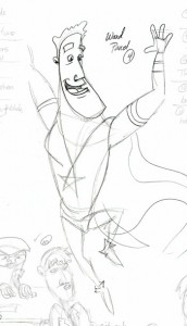
For this page, it was my task to draw several, CE-familiar elements, including the gayest nightclub this side of The Toolbox, complemented by two proud, gay men, TJ and the Captain’s very own son, Ward!
A Few Extra Thoughts ~ON~ Episode 3, Page 4
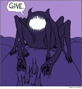
When we first started this Rice Boy story, I wasn’t sure whether or not I wanted to try and mimic the less-is-more approach to the artwork that Evan Dahm did on the original. His line work is so sparing, there’s nary a line that doesn’t exist without a specific purpose. The landscapes, the characters, they’re all crafted in a way that wastes nothing and uses everything. Thus was the issue with Father Dimmon, the menacing creature  that Gerund, Rice Boy’s faithful travel companion, encounters on his journey.
You can see that Dahm’s original seems almost snake-like and slithery in it’s simplicity. The smooth curves bring to mind that which we are all inherently terrified of and the massive, paw-like, clawed feet (hands?) foretell of a mauling that nothing could survive. And that’s with being nailed to the earth!
Rather than ponder over which direction I should take with such a fearsome character, I just let my pencil do the talking. Or walking. Or whatever action makes the most sense. And what I came up with was much more intimidating, much more immovable, and ten times as unnervingly monstrous!
Now that there are two versions, I can look at them objectively and judge them for what they are. And while I definitely believe that there is room for both, and possibly even more if the opportunities present themselves, Dahm’s is one that really stands for something and works on a completely different level than mine to earn the chills and uneasy feelings that Father Dimmon should evoke.
A Few More Extra Thoughts ~ON ~ Episode 3, Page 4
Those with lower resolution monitors or just plain bad eyes might not be able to tell what this speck on the horizon is in panel 5. I assure you, it is something real and intentional, and now, with cutting-edge technology, I can allow you to zoom in, CSI-style, and enhance the image to see what’s really there!
Simply click this link and type away at your keyboard like a madman, furiously zooming and enhancing panel 5 to discover what’s really there.
And a special thanks to the Tosh.0 website for finding this Interwebular gem!
A Few Extra Thoughts ~ON~ Episode 3, Page 13
After featuring various webcomics characters in this page, I received notices from nearly everyone seeking legal action. However, when I told them that they, too, could be a part of the awesome fun that is Digital Strips Adventures, they all dropped their respective lawsuits and hopped on board!
Seriously though, I got nice words from everyone involved and it’s only right to give each and every one of them a quick shout, as well as link to their respective reviews over at Digital Strips. Enjoy and wish me luck in convincing every one of them to contribute to the DSA project!
Clockwise, from bottom-left:
Man, from Rosscott’s The System (Episode 168)
Nadia from Ramon Perez’s Kukuburi (Episode 183)
Cailyn and Asher from Garth Cameron Graham’s Finder’s Keepers (Episode 179)
Edmund Finney and Sasquatch from Edmund Finney’s Quest for the Meaning of Life (Episode 176)
Ed and August from Pajama Forest (Episode 178)
Robin Hood from Much the Miller’s Son (Episode 173)
Buff Unicycler from Amazing Superzeroes (Episode 51… ok, this was really just one of my own that I wanted to include, so sue me)
Bill from The Legend of Bill (Episode 163)
Clovis from Imagine This, our next participant of Digital Strips Adventures! (Episode 170)
Gag Strip vs. Full Page
You thought I disappeared, didn’t you? Well the winter ‘storm’ barreling down on the south better be HUGE. I’ll I here about is that this town and that town is going to get snowed in. This is a place that the worst snow in the past 50 years was 6 inches. So the problem isn’t going to be the snow in so much as the idiot drivers who can’t drive in a drizzle but think their SUVs can drive on ice.
Anyways episode 4 brings in a whole new concept then we’ve previously explored before. The most obvious difference is the framing, but maybe it’s the coloring? Either way it’s part of the whole experiment in exploring everything that is webcomics. This change, though, brings to mind many questions about why people choose one format over another. I like to think the laughs you get from reading Imagine This are equal to the jokes we used in Captain Excelsior but we have to admit the delivery is completely different.
The short banner like gag strip immediately puts the reader in the mode for laughing because very few of us can think of a serious comic that uses the one line horizontal layout that isn’t trying to be funny. The full page, on the other hand, is historically the realm of graphic novels, even if it gives artists more room to set up a joke. Your audience may or may not be ready to see some slapstick or witty pun, if delivered 6 panels further than normal.
So what is the better presentation?

