November 16th, 2009
When we first started this Rice Boy story, I wasn’t sure whether or not I wanted to try and mimic the less-is-more approach to the artwork that Evan Dahm did on the original. His line work is so sparing, there’s nary a line that doesn’t exist without a specific purpose. The landscapes, the characters, they’re all crafted in a way that wastes nothing and uses everything. Thus was the issue with Father Dimmon, the menacing creature 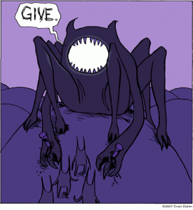 that Gerund, Rice Boy’s faithful travel companion, encounters on his journey.
You can see that Dahm’s original seems almost snake-like and slithery in it’s simplicity. The smooth curves bring to mind that which we are all inherently terrified of and the massive, paw-like, clawed feet (hands?) foretell of a mauling that nothing could survive. And that’s with being nailed to the earth!
Rather than ponder over which direction I should take with such a fearsome character, I just let my pencil do the talking. Or walking. Or whatever action makes the most sense. And what I came up with was much more intimidating, much more immovable, and ten times as unnervingly monstrous!
Now that there are two versions, I can look at them objectively and judge them for what they are. And while I definitely believe that there is room for both, and possibly even more if the opportunities present themselves, Dahm’s is one that really stands for something and works on a completely different level than mine to earn the chills and uneasy feelings that Father Dimmon should evoke.
October 7th, 2009
In a hopefully ongoing feature, I’ll be posting some sketches and/or links to our production blog (also serving as 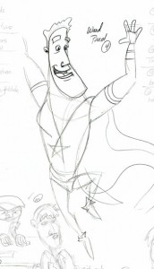 my own personal sketch blog) that give some insight into the process behind the creation of Digital Strips Adventures.
Webcomics are different and more organic than a simple printed page because they’re alive, they’re changing, and evolving right before our very eyes. Learning the process behind that evolution is extremely exciting to me. Now, whether or not that ends up being the case for this comic remains to be seen, but I figure it’s a possibility and so I’ll post what sketches and thoughts I can.
For this page, it was my task to draw several, CE-familiar elements, including the gayest nightclub this side of The Toolbox, complemented by two proud, gay men, TJ and the Captain’s very own son, Ward!
October 5th, 2009
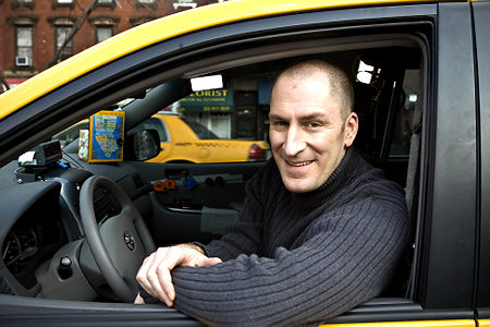
So I mentioned last week that I would post more about the process of drawing a taxi cab from reference, but really, what more is there to be said? I grabbed a great angled shot from Google, copied it, and recreated, by hand, the most perfect recreation of an automobile in the history of comic strips. Pretty self-explanatory, really.
It looks so real, in fact, that I feel like I could jump in and take a ride, possibly with a chance to win cash prizes?

Sorry, any chance to feature Ben Bailey, host of Cash Cab on The Discovery Channel, is one I will always take. More on the current strip, including development sketches and a link to the production blog, in the next update! Stay tuned!
September 30th, 2009
No, not the Pixar living machine flick, though I still maintain that it is by no means the worst of the Pixar/Disney masterpieces.
No, I am more referring to the ability to draw cars, more specifically to the fact that I cannot do this. I really wish I had saved the original draft of my taxi cab; this time-jumping, black hole-afflicted slick piece of American manufacturing had so many structural inconsistencies, it wouldn’t have left even the modern production lines we’re cursed to deal with. Think the monstrosities kids make their first trip through wood shop and then scale it back a bit.
So, in my fervor to complete something resembling a real-world automobile, I turned to Google. Almost immediately, I was greeted with numerous angles and sizes of taxi cabs, one of which fit my needs PERFECTLY. So, I did what any self-respecting artist would do in this pinch: I Photoshopped the heck out of the picture and called it my own.
I kid, of course. I’ll talk about the process next time, so stay tuned…
September 22nd, 2009
Something I really want to work on with this series is establishing a setting and really making the characters feel like they’re part of the world, that they exist in a real place. Cartoony or not, backgrounds establish both setting and mood. Go back to any Looney Tunes cartoon and check out the setting of any given short. I’ll use the classic, “What’s Opera, Doc?”, as my example.
↓ Read the rest of this entry…
 that Gerund, Rice Boy’s faithful travel companion, encounters on his journey.
 my own personal sketch blog)